 Vibe magazine have used a large center image of a famous singer chris brown it fills the background of the front cover. The picture is in front of the masthead to make it stand out more there is no other pictures on the cover so it shows the importance of the main picture, it is the first thing you notice when looking at the magazine. The magazine uses a colour scheme of colours white, green and red it makes the magazine look more professional. They have included the barcode into the front cover and have also there is writing around the picture telling the reader what they can read about inside the magazine making them more interested. Also there is a rhetorical question in bold that links in with the main picture.
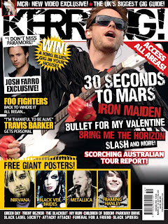
 Kerrang also uses a large center image that covers the mast head which makes it stand out. However the front page also has five smaller images which makes the cover look busy and slightly over crowded, it will take attention away from main image. They have used a colour scheme consisting of yellow, red, black and white which makes it look more professional. The barcode is included in the front page, there is also have story titles around the main image telling people what they can read inside the magazine. Also there is 4 smaller images that can be found inside the magazine as larger posters which may make the reader want to buy the magazine more in order to get the free posters.
As well as the other magazines Blender has used a large center image of a popular singer. The image covers the masthead, also there is no smaller images on the front cover which means the readers attention will be drawn to the large image. There is a simple colour scheme of pink, white and black. The cover is very simple and only has a few article references, this means it doesn't look to busy but still has enough information to make people interested in buying the magazine and reading further. There is no barcode on the front which may mean that it is on the back cover of the magazine. It has included an offer of 'free downloads' and gives the page number which will be where they can find more information on how to get the free downloads.
 Like the other magazines NME have used a large image of a well known singer that takes up the whole background of the front cover, however it is behind the masthead which makes the name of the magazine stand out more. There is only really two colours used for the writing: black and white although the red hair adds a splash of colour to the cover, the colours make it look more sophisticated and professional. They have added a quote which is from the person in the main image 'I would never have got through the X Factor auditions' this makes people want to find out why she said this so they will want to read the article. The barcode is on the cover which may include the price of the magazine.

